Get Support

Ketryx

Technology Case Study
Ketryx’s FDA regulatory compliance software speeds up the development of medical devices. Even though they were a fully-funded startup in the technology space, they were still missing important brand elements and a website to match their innovative approach to complex problems and show off their groundbreaking product. Enter the magic:
Our Role

Design System
UI/UX Design
Illustration
Animation

Engagement

Summer 2024


Brand Identity

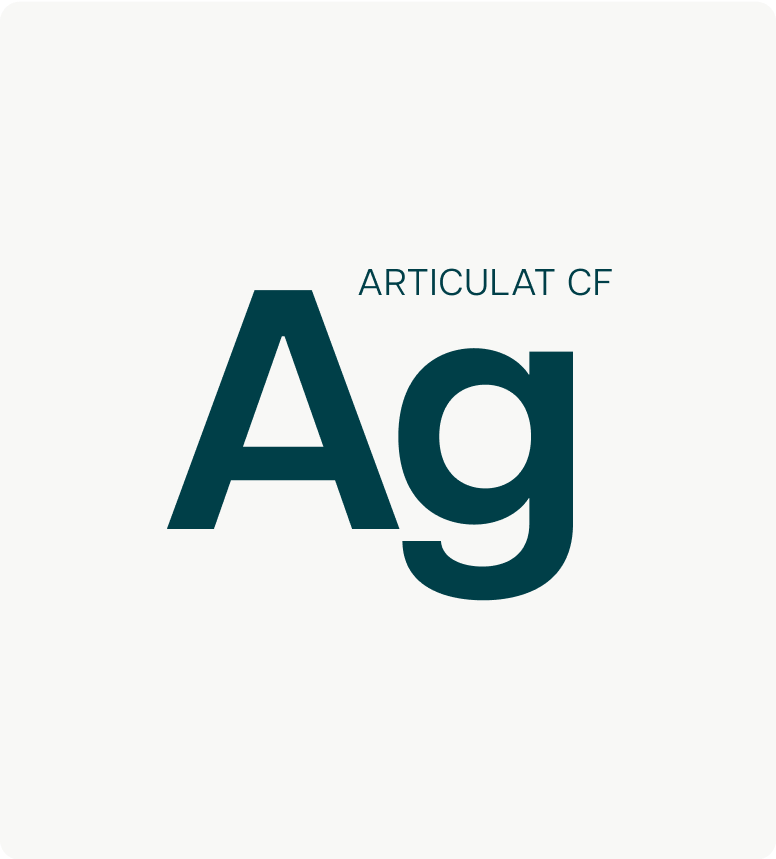
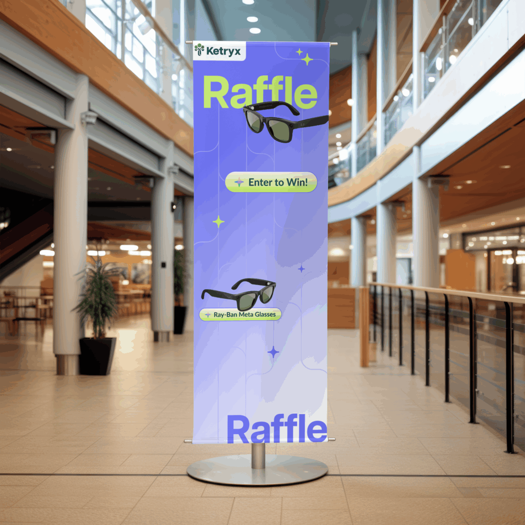
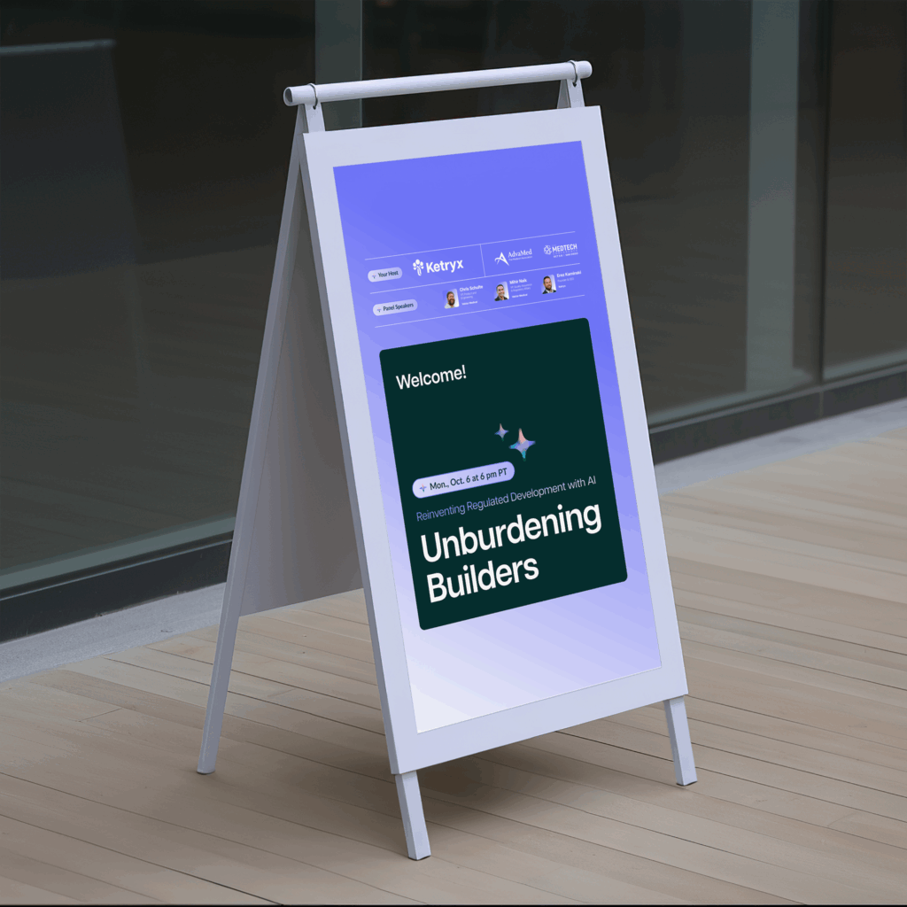
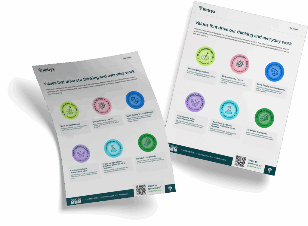
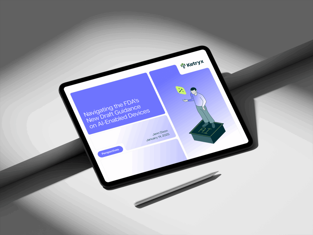
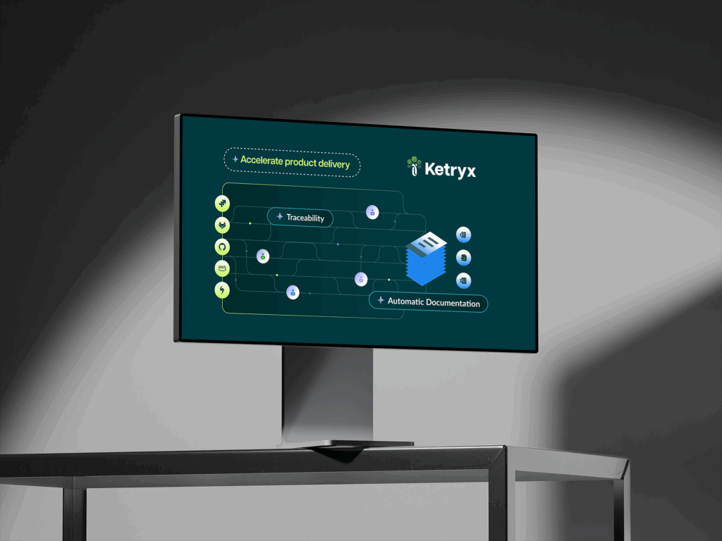
For Ketryx, we established a modern color palette and typography that reflected their commitment to precision and trust. Each color was chosen to balance a calming presence with professionalism, while the clean typography gave their brand a modern and approachable feel. We also reimagined their product dashboards, distilling them into a sleek, cohesive visual that matched their new illustration style.

During our brand discovery process, we uncovered a key metaphor to shape Ketryx’s story: the idea of medical device compliance as a confusing maze for developers. Ketryx’s role became clear—they pull developers out of the maze and place them on a conveyor belt, symbolizing the streamlined efficiency of the software manufacturing lifecycle that Ketryx enables. This powerful narrative shaped their overall brand story and visual identity.
Web Design

Ketryx’s new website design centers around a clean, spacious UI, ensuring clarity and ease of navigation for their users. With an emphasis on white space, the site guides users through clear, defined flows, making it easy to explore Ketryx’s complex product features.

Over our 3 month engagement, we designed 30 custom pages in Figma for desktop and mobile and built a comprehensive component library to support future expansion. Our primary goal was ensuring that every element of the design system remains consistent and scalable as Ketryx grows.

Illustrations

Using an isometric view, hard outlines, and soft fills, we brought Ketryx’s story to life through visuals that balanced complexity with clarity. The illustrations featured key metaphors like mazes, assembly lines, and conveyor belts, representing the tools and processes that Ketryx provides for developers. To keep the focus on these intricate graphics, we used a simple color palette, ensuring that the visuals remained clean and easy to understand.

We also played with the concept of cards moving along the assembly line—these cards represented the software that developers create using Ketryx’s tools. As the cards moved along, they expanded into detailed views, interconnected through lines that highlighted the precision and interconnectedness of Ketryx’s platform.
Motion & Interaction

To bring the Ketryx website to life, our design team meticulously mapped out micro-interactions throughout the site. From subtle hover effects to satisfying transformations on click, these details added a layer of engagement that kept users immersed in the experience. The interactions apex was the interactive map, where each movement guided users through Ketryx’s ecosystem with ease.

The centerpiece of our animation work was a larger storytelling piece that illustrated how Ketryx accelerates the journey of medical device design, development, testing, and deployment. We took charge of this animation from start to finish—conceptualizing the narrative, storyboarding the visuals, and building out the final animation. The result was a dynamic and engaging visual story that simplified a complex process, showing users how Ketryx helps bring medical devices to market faster and more efficiently.

Project collaboration

The design system we built for Ketryx is as robust as it is versatile, featuring 243 custom illustrations and dashboards alongside hundreds of carefully crafted icons. We meticulously defined color codes and use cases, ensuring consistency across every visual element. All of these assets are accessible to the entire Ketryx marketing team through Figma, enabling them to easily maintain brand consistency as they grow.

This system empowers their team to seamlessly integrate new visuals, build out pages, and keep their brand fresh while staying true to their established identity. It’s a foundation that scales with them, supporting their marketing efforts with precision and style.

2021:

A Vibrant Visual Direction

As Clearloop’s digital transformation journey progressed, it was time to breathe new life into their visual identity. Wizardly’s creative team went to work, crafting a myriad of bright, cheerful illustrations with playful yet expert animations. These visuals spoke volumes about Clearloop’s mission to bring solar energy to middle America. The design assets found their home on Clearloop’s WordPress site, forming a captivating narrative of sustainability, innovation and joy.

2022:

An Interactive Innovation

In 2022, Clearloop’s visionary CEO, Laura Zapata, had an idea that pushed the boundaries of design and technology. After launching their groundbreaking solar energy project in Jackson, Tennessee, she envisioned an interactive dial that would showcase how much energy they were reclaiming for the city, in real time, 24 hours a day. Wizardly’s development team embraced the challenge, crafting a code based on current readings that animated a sundial on their website. This interactive feature juxtaposes carbon avoided with solar energy gained, offering an engaging and educational experience for Clearloop’s audience. Oh, and that year we gave Clearloop a whole lotta print and deck goodies!

2022:

A Transformational Acquisition

Silicon Ranch Corporation, one of the nation’s largest independent power producers, recognized the potential of Clearloop’s groundbreaking work and acquired the clean tech pioneer. This acquisition marked a significant milestone, expanding Silicon Ranch’s offerings to corporate buyers seeking comprehensive renewable energy solutions. Clearloop continued to operate under its brand, led by CEO Laura Zapata, sharing office space with Silicon Ranch.

Case Studies Summary

The journey with Clearloop showcases Wizardly’s commitment to supporting innovative companies on their quest for sustainable impact. We thrive on collaborating with trailblazing tech startups during their funding phases, helping them position their brands to engage with both audiences and investors effectively. As Clearloop’s story of sustainability and clean energy continues to unfold, we look forward to exploring new narratives and embracing future chapters of design and innovation together.

Explore the Site
Case Studies Summary
Wizardly helped Ketryx turn complex compliance into an accessible, empowering experience on the web.
Creative Direction
  • Brand identity expansion

  • Colors for the web

  • Font selection

  • Illustration style

Web Design and Dev
  • 30 pages for desktop and mobile

  • Component library

  • Design system

  • Website interactions

Visual Design
  • 243 Isometric illustrations

  • Hundreds of icons

  • Simplified product dashboards

  • Animation project


Check out more of our agencies projects

Strategy, Websites, Design

Ready to take your brand to the next level?

Work with us
Start Project
Become a partner

Existing client?

Get Support
Cart Overview