Ercule
Agencies Case Study
At Wizardly, we live for the excitement of reimagining brands, especially when our clients are eager to take bold risks. Ercule.co is one of those standout brands. Their commitment to impactful work and innovative content marketing tools inspired us to embark on a creative journey together. Our mission was to make Ercule.co not just stand out, but to truly shine in their industry.
Our Role
- Brand Identity
- Logo Design
- Illustration
- Web Design
Engagement
- One-time Project
Bold, yet deeply human
The challenge was clear: what’s the next chapter for Ercule.co? We dove deep into research, evaluating user needs, market trends, and competitors. We mapped out two predictable styles and introduced a curveball—a daring visual direction that blended the sophistication of Saul Bass with the playful ingenuity of a Rube Goldberg machine. To our delight, Ercule.co embraced the curveball, a testament to their adventurous spirit and trust in our vision. The result was a visual identity that was as captivating as it was unexpected.
- Identified Pain Points
- Set Project Goals
- Conducted User, Competitor, and Market Research
- Presented Visual Identity Concepts


Makes complex science feel intuitive
Alloy’s web presence is designed to meet the needs of multiple audiences—from biotech founders and partners to researchers and investors. We designed a site that makes complex science feel intuitive, with clear user flows, fast-loading pages, and bold headlines that reinforce Alloy’s positioning as a leader in biotech innovation.
Site architecture and copywriting for key audience segments
UX strategy to support both storytelling and lead generation
Scalable component library used across new site launches

Web design
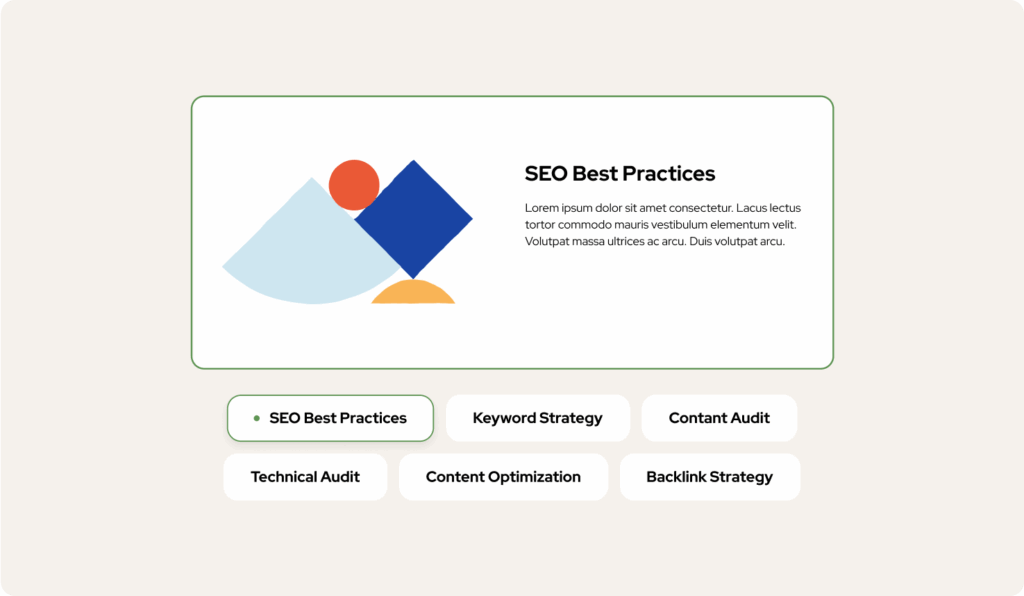
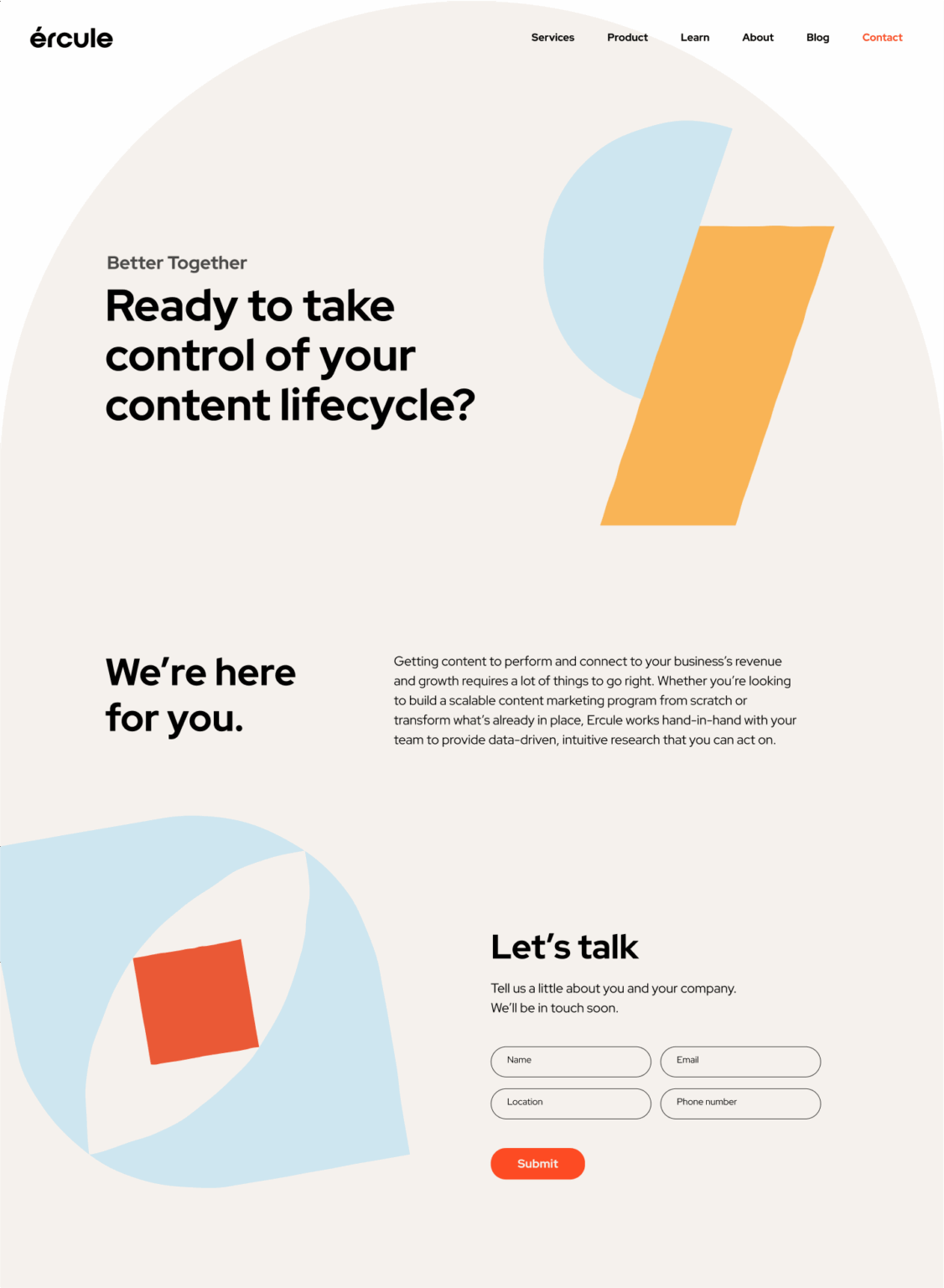
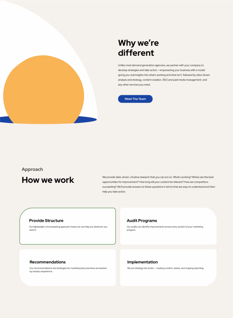
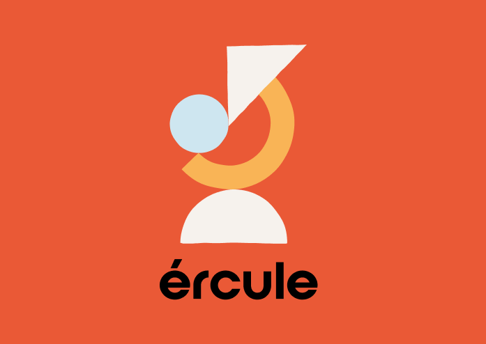
With a clear direction set, our design and UX teams got to work. The process was a collaborative dance, with Ercule.co involved at every step. We transformed the initial concepts into a living, breathing brand identity. From the logo design that captured their innovative essence to website prototypes that embodied their playful yet professional approach, every detail was crafted with care. The outcome was a brand story that resonated deeply with their audience, conveying both their expertise and their unique character.
- Collaborated Closely with Ercule.co
- Brought Concepts to Life
- Developed a Cohesive Logo and Visual Identity
- Delivered Engaging Website Prototypes


Our Role
Ercule.co’s brand evolution with Wizardly is a story of creativity, risk-taking, and collaboration. By choosing the unconventional path—the curveball—they aligned perfectly with our commitment to pushing creative boundaries. The resulting visual direction is a seamless blend of simplicity and whimsy, capturing the dynamic essence of Ercule.co. Together, we’ve not just redefined their brand but also set them apart as a beacon of innovation in their field.
- Logo design
- Custom illustrations
- Color palette
- Typography
- Custom Web Illustrations
- Custom Figma Website Prototype
- LinkedIn headers
- Digital graphics